|
 It’s the near future and young adults are divided into two factions: the ‘Frats’, the privileged college upperclass, and the poverty-stricken ‘Mutants’, a society of punk protestors. We start out with each group separately but in mirrored situations – a pack of ‘bad’ frat members are in trouble for repeated pranks on a ‘good’ frat, while on the punks’ side of the city, ironically-named peaceful leader Eddie Pain scolds nuclear-scarred metal-armoured Splatter for actions that make his name not at all ironic. It’s when the troublemaking frat boys are sent out to kidnap a Mutant for a party prank that the two groups collide, and Splatter seizes the opportunity to murder Eddie, which defaults himself to leader status, and pin it all on the fratboys, which results in a chase movie with slasher overtones where escape seems impossible. It’s the near future and young adults are divided into two factions: the ‘Frats’, the privileged college upperclass, and the poverty-stricken ‘Mutants’, a society of punk protestors. We start out with each group separately but in mirrored situations – a pack of ‘bad’ frat members are in trouble for repeated pranks on a ‘good’ frat, while on the punks’ side of the city, ironically-named peaceful leader Eddie Pain scolds nuclear-scarred metal-armoured Splatter for actions that make his name not at all ironic. It’s when the troublemaking frat boys are sent out to kidnap a Mutant for a party prank that the two groups collide, and Splatter seizes the opportunity to murder Eddie, which defaults himself to leader status, and pin it all on the fratboys, which results in a chase movie with slasher overtones where escape seems impossible.
Ronald W. Moore (who also co-wrote with Kathleen M. Hagan) shot this as Splatter around the midpoint of the 80’s, perhaps the best time to make a genre film. Advertising played up the Texas Chainsaw Massacre connection of having Ed Neal and Marilyn Burns in the same film again, but the links are stronger. This was shot in Austin, Texas, and a TCM poster can even be seen in a shop window in one scene. Yet Future-Kill doesn’t emulate the famous other, in fact it goes out of its way to be a 180 degree counterpoint. Instead of a rural setting and retarded killer wielding second-hand-hardware, we have the inner city, and a calculating, technologically superior killer.
After playing the Hitchiker, it’s good to see Ed Neal (who also wore a producer’s hat on this) bumped up to lead villain status. I personally find Splatter a more textured badguy then Leatherface. I was entranced by the number of technogadgets housed in Splatter’s armour, which reveal themselves as the film progresses, usually in methods of murder. Except one time after being humiliated by a hooker, when Splatter gets all low-tech on the girl and we’re treated to death by corrugated iron. Marilyn Burns looks pretty rough in the character of Dorothy Grim, a past-her-prime punk (and Splatter’s missus) who’s a far cry from sweet Sally Hardesty.
And that’s what this movie is about: polarized opposites. It’s set up as a frat comedy in the Animal House vein only to turn upside down into a serious violent film at the end of the first act. Anyone who tuned in blind on cable would have had one hell of a surprise at this point. The story also illustrates a massive ecological and cultural divide in future society, which in the 80’s we seemed to be moving towards (with the decades’ emphasis on material goods). Yes, behind the gore and exploitation framework this is a ‘message’ movie, I generally don’t care if that’s implied subtly or waved with a giant waving sign, all that matters is that saying something with the film was important to the creators.
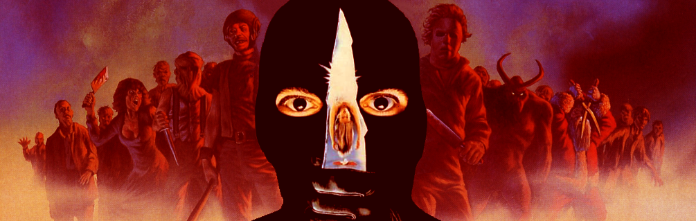
Almost every reviewer loves to point out that the poster art is far better then the film. I tell you, they must think they’re geniuses for each coming up with that tired zinger. Let’s examine: would they prefer films to have cover art somehow psychically tailored to their specific like or dislike of a film? Terrific covers are what got us video store generation horror fans to pick up movies like this of unknown quality that we otherwise wouldn’t consider. There’s also the fact that it was designed by Alien’s HR Giger (after initial shooting, reportedly) which immediately sets his art a high bar not even a multimillion dollar budget could eclipse (See: Species). So comments like that are real cheap shots. To play devil’s advocate, HR’s art, drowned in silver is a slight misleading, pointing toward a more sci-fi tone. Giger did also design an alternative piece which skews completely the other way, into horror imagery. I prefer our Australian version of the art, which only adds some blue and red hues to provide a more balanced cover accurate representational of the film’s interior.

Future-Kill (which I grew up thinking was called Future Hill due to the title font) gives me such a rush every viewing. My favourite supporting player is Tom (Barton Faulks from the also excellent Edge of the Axe). He took the transition from carefree jokester to adrenelised killer in two easy steps (1. face being about to die, 2. strike first). Credit also goes to the black hole urban cityscape of decayed brick, rusted iron and sparse neon that backdrops the blood, sweat and fears. The musical score by Robert Renfrow is a downbeat but hopeful synth track. Let’s also pay due to some hilariously filthy lines like “I’d rather suck off a ballbag”, “you worthless shit-cunt”, “let’s score some gash” and “tonight’s feature: the worm in the cage… in 3D”.
|